Interactive graphs visualize fatality rate
Road accidents and their far-reaching consequences on humans and society are of great concern to all actors in the road transport system. Globally the number of fatalities/year grows and is currently in the order of 1.3 million.
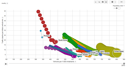
SAFER has explored an interesting way to look at the road safety development across the globe. In this example, we can view the 13 countries which constitute the ESV Global Focal Points. The data used are publicly available on-line from several global organisations providing data. The graphs were initially created and presented at the ESV conference 2015.
The below graph is an example that illustrates the decrease in fatality rate since 1990. In this graph we show the traffic deaths per billion kilometres driven together with the number of vehicles registered per thousand inhabitants. The size of the bubbles is representing the population. Since this is based on data publicly available and easy accessible on the web, some countries do not have full coverage for all years in the graph.
Another graph visualizes the data in a different way: the decrease in traffic deaths per kilometre driven for each year since 1970. The decreasing trends are evident even in this graph.